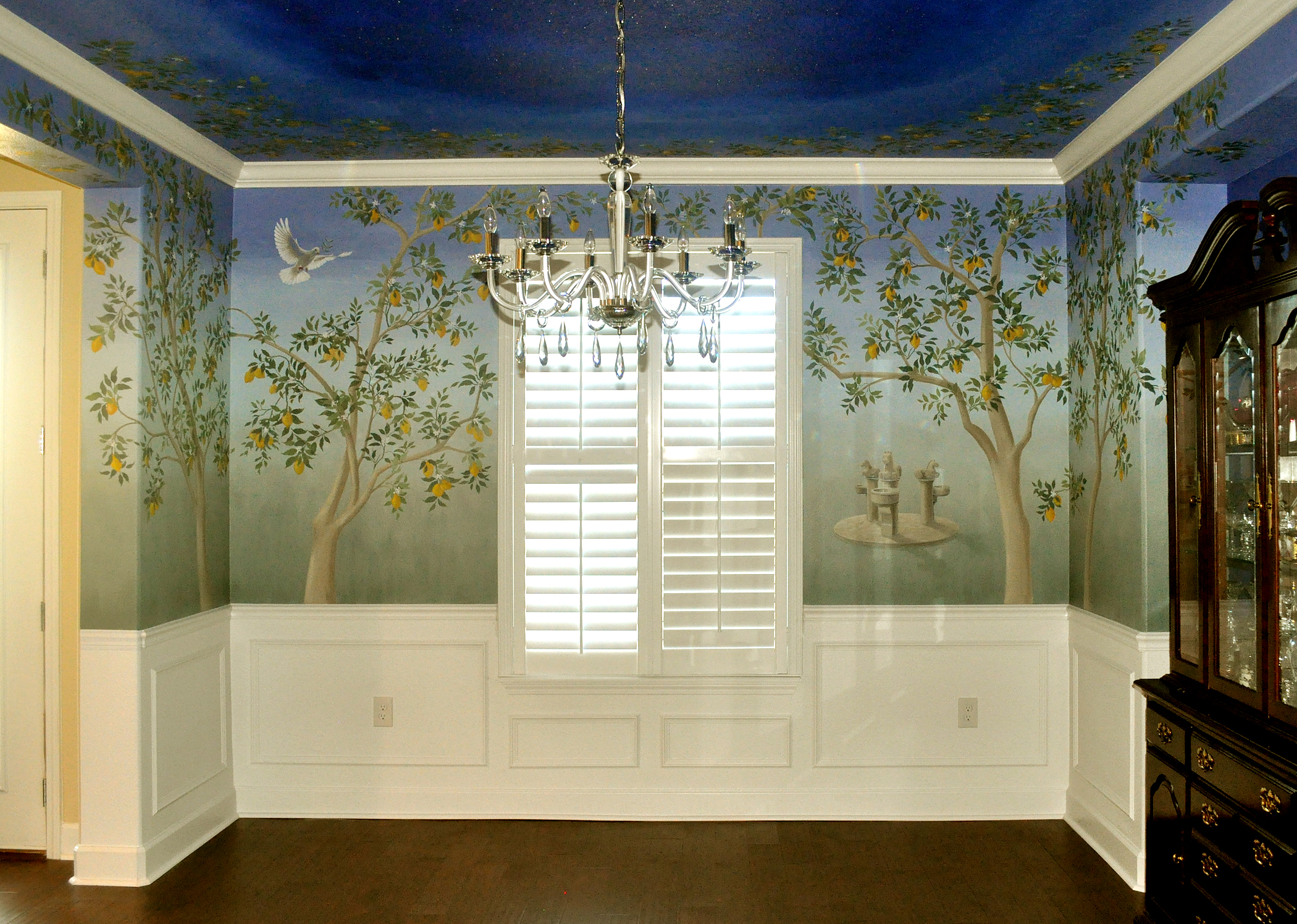
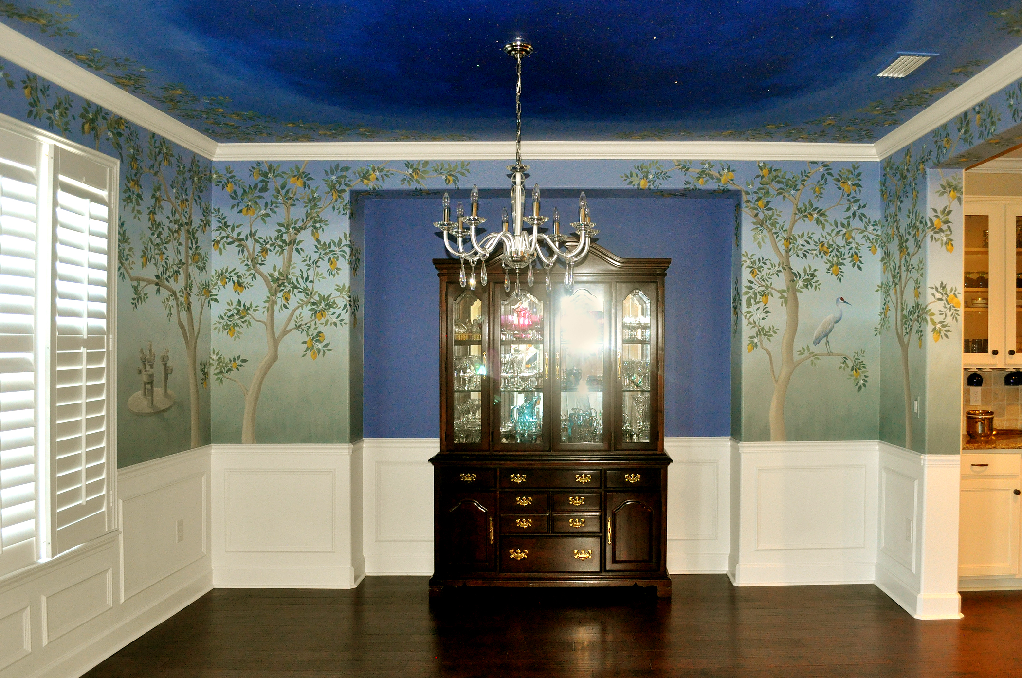
Main Wall Completed
View from Entrance
There were many challenges to this design. The first was how to have lemon trees reaching up into a night sky? I didn’t want the trees directly against a deep blue. My clients were also concerned that the room not become too dark.
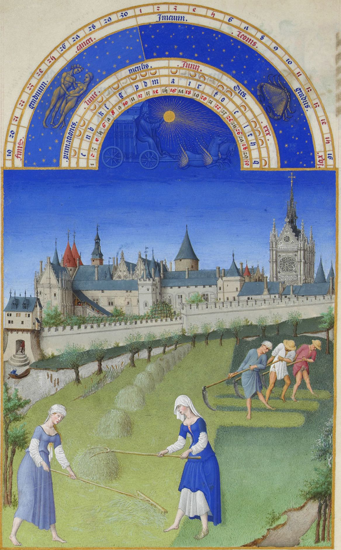
I suggested we transition lighter walls up through dusk and into a night sky. I had in mind the beautiful medieval Book of Hours, Les Tres Riches Heures du Duc de Berry which moves from day to night in one image.
Medieval Book of Hours
This meant taking an ombré effect from night to dusk on the ceiling and into the walls.
Adding to the challenge – as I designed the walls, I knew I did not want a horizon line cutting across the imagery. That meant obscuring the horizon by taking the ombré right down to the base of the image – the chair rail.
Here’s a shot of one wall’s design elevation in progress:

Lemon Tree elevation
In order to visualize the overlap of corner trees on the ceiling, I built a rough, white model and attached the wall and ceiling elevations to it. The resulting model was taped and pinned together for easy disassembly and transport. Presenting this to the clients helped them visualize their future dining room.
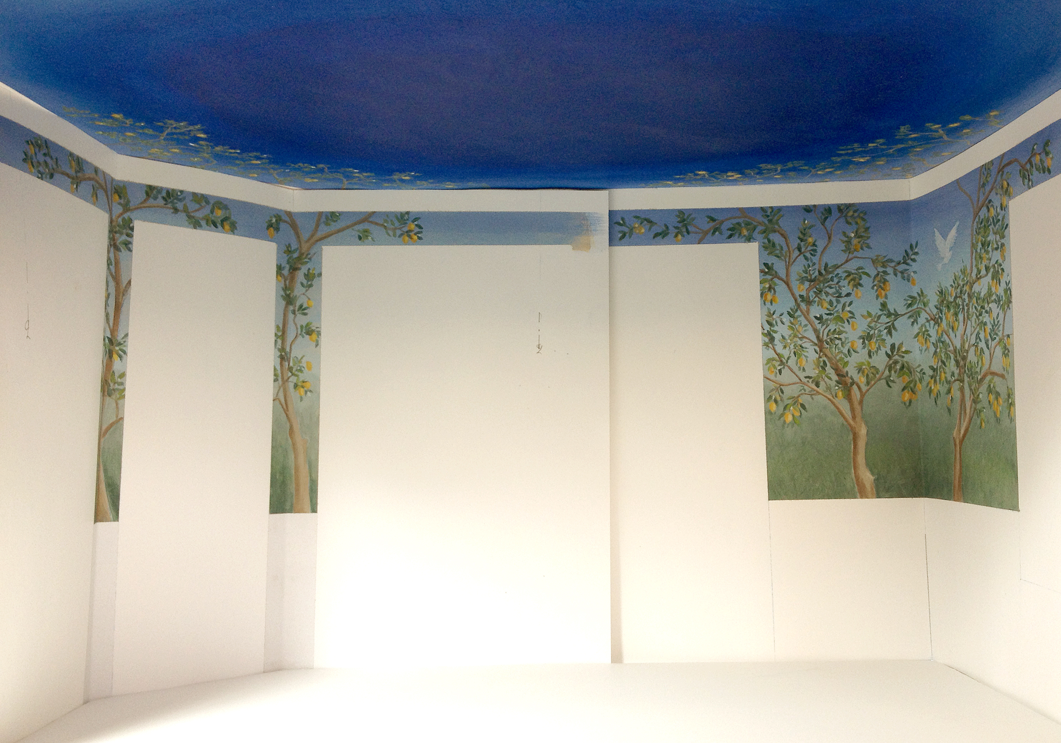
Model view of entry arch and columns
Watch the slideshow and see further explanation below:
Of course, I began with the background. The ceiling and walls were textured, which added to the challenge of the gradation.
I worked a textured underlayer beneath the final grassy foreground to give it some movement, then worked over it to lighten the final effect. It took me about a week of tones and half-tones and half-half-tones to get the transitions smooth.
Referencing my renderings, I chalked in the trees, then based and added minimal highlight and shade. I did not want overly dimensional trunks, knowing my leaves would be stylized. I also didn’t want the trunks to dominate the composition. My natural bent is for high contrast so I had to restrain myself from fully developing their form.
I ordered a variety of lemon leaf stencils from Cutting Edge Stencils. These were excellent shapes but I was a little concerned about scale. Would they be too small? So, before starting the project, I cut a bunch of additional leaf stencils in larger sizes. In the end, I used all of them. Layering the slightly different sizes provided a better sense of depth.
The stencils were applied randomly, layered and with mottled tones.
Once an area had the beginnings of leaves, I stopped and added the lemons. I wanted to be sure I had leaves both behind and in front of the fruit. I stenciled the lemons with a base color and then added lights for simple form. When the lemons were dry I continued with the leaves allowing them to overlap the lemons.
My clients had been enchanted by the lemon blossoms at their Sorrento restaurant so I scattered blossom shapes throughout. I had pre-cut little stencils of 7 or 8 blossom shapes.
While I was working on the trees, I chipped away at the starry sky. I used a combination of Swarovski flat-backed crystals and silver mica-powder mixed with clear glaze.
The mural’s other special features are a peace dove, a sandhill crane and a triple merhorse fountain. This unique feature was inspired by my clients’ trip to Italy. There is a large, elaborate fountain in Taormina, Sicily, that has adorable merhorses placed along its outer edge as you can see in my prior post here. My clients requested I include only the merhorses so I created a composition that would provided the best view of all three.
A word about color: It is coincidental that my mural colors appear so similar to the Book of Hours image. I did not actually reference that work during the design process – it was simply in my memory as an example of a prior artist transitioning from day to night in a single image.
The colors of my mural were based on the existing colors in the home. Every color used in the mural was coordinated with the near-violet blue of the large niche or the warm ochre-tan base color and of the surrounding spaces. Nearly every color in the mural has one or the other or both of these two reference colors in their makeup.